
Using Sparklines to show data trends in Excel
Do you want to show your data like this rather than just numbers and percentages. To do this we use
Sparklines.
 |
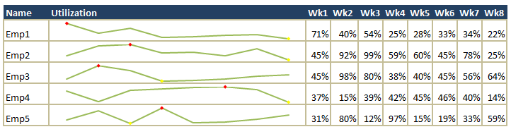
SPARKLINES(Showing drop and increase in Utillzations).What is a sparkline?
A Sparkline is a small chart that is aligned with rows of some tabular data and usually shows trend information.
Here is an example of sparklines in creating utilization of the employees
 Creating Sparkline
Creating sparklines in excel 2010 is very easy. You follow 3 very simple steps to get beautiful sparklines in an instant.
Some tips and tricks
This is one of the ways you can make your spreadsheets look for visually appealing in excel. Hope this was helpful.
|

No comments:
Post a Comment